Monday, April 29, 2013

Connecting Cultures to a New Horizon (Final Studio Project 3rd Year)

Location: Santa Monica
Competition: ASCA Steel Competition 2013

CONCEPT
For many, Santa Monica, California is a to relax, to have fun, and escape reality. But for many—especially 
children growing up in gang-infested, crime-ridden, economically deprived neighborhoods like South Central—there is no escape. Year after year, too many children and teenagers die from gun violence and gang wars. Of those who die, a good number lived their life without seeing the beautiful side of California in person. Many never experienced the Pacific Ocean, even though it is less than an hour away from their home. They only know it from television.

On the flip side  many children are below the poverty line, and some are even homeless living in Santa Monica. Though these children see the beach, the boardwalk, and many of the other oceanfront attractions, their experience differs from most Santa Monica residents.


The New Horizon Bridge connects cultures between Santa Monica and children of South Central so they can experience this vast potential of the Pacific Ocean without limitation. The entire bridge will literally start in South Central and end here in Santa Monica, joining the two realities. The undulating form of the bridge creates an experience that represents life in this part of California. At both ends, members of the intricate eight-inch diameter steel structural system reach out as a gesture to pull people from Santa Monica and South Central towards this experience. Moments of compression and expansion represent moments in one’s life where that individual might feel pressure, sadness, loneliness, happiness, freedom, excitement, and other emotions. The middle of the bridge has panels of steel surrounding the structural tube and connecting to the structural tube, forming different shapes with different colors representing the amalgamation of cultures in Santa Monica and South Central. Finally at the end facing the beach, the bridge spills out into a breath-taking view of the beach horizon, representing the bigger picture in life. This gesture emphasizes that no matter what kind of experience one may go through in life, it will pay off in the end with a big reward.
I am interested in further developing my design and concept to submit to the national competition at the end of May 2013. There are several issues that still need to be resolved to make my concept whole and fitting to the actual design and function of the building. Over these next few weeks, I will explore these options push to win this national competition. 

HOW IT RELATES TO OTHER DESIGNS
A pattern in this structure that has occurred in readings and in discussions is how the designer uses the environment around him to influence him or her. In every architecture movement, there was something around the designer that influenced him or her, whether it be political issues, social issues, issues of design, coming up with a new style, etc. Their surrounding environment influenced them, for the most part. I've been inspired by the children of South Central and Santa Monica to create this environment for them. They have designed this bridge. I was just the vessel that placed it on a piece of paper. All my design credit goes to the less-fortunate children of South Central and Santa Monica who do not see what the average child in their community sees.


Wednesday, April 3, 2013

Open Plan Concept

The Free Plan is one of the most critical and well-formulated modifications to architecture in 
recent history. The free plan has influenced not only the design of the building layout in plan view, but other elements such as the facade and structure of a building as well. Two of the most notable and influential architects of Modern architecture, Louis Kahn and Le Corbusier, implemented free plan into their design. Both of these designers use open plan for similar purposes, but go about them in different ways. 

Louis Kahn


  • uses free plan to allow flexibility within the design
  • allows architect to create space to meet the users' requirement and desires for the space
  • allows natural light to penetrate every corner of the floor to ceiling windows
Esherick House. Philadelphia, PA
Salk Institute. San Diego, CA

Le Corbusier
  • #3 of his "Five Points of Architecture"
  • free designing of the ground plan; absence of supporting walls means the house is unrestrained in its internal usage
  • free for architect to configure into rooms of re-purpose to fit a certain design
  • allows buildings to be created without limited wall placement and more freedom for interior and exterior design
  • made possible by a system of supporting stilt-columns that moves load-bearing structure to the exterior
Perspective drawing of Le Corbusier's open plan concept; 3rd point in his "5 Points of Architecture"

Villa Savoye. Poissy, France


Thursday, February 28, 2013

Breaking Down the Emergence: 5 Influential Movements The Drove Modernism

Architecture has continually emerged over the milleniums and centuries. Over the past 200 years, It has had more pivots, shifts, and changes than ever before. We know this as Modern Architecture. These key movements include Art Nouveau, Arts & Crafts, De Stijl, Russian Constructivism, Italian Functionalism, and Expressionism.

Arts & Crafts Movement

The Arts & Crafts movement began in the late 19th Century in England and later spread to America. The movement was inspired by social reform concerns of thinkers like John Ruskin, Walter Crane, and William Morris. One of the beginning philosophies that established the movement was the notions of good design are linked with the notions of a good society. This contrasted the industrial society in which workers crafted and made products in factories, but were not rewarded for those products. In the Arts & Crafts Movement, the worker was awarded for the craftsmanship of their product. The rise in the consumer class was pivotal. Poorly designed manufactured goods was pivotal, which allowed craftsman to sell their products and the consumer class to buy better designed products. The goal was to create a design that was for the people. These designs were heavily influenced by Islamic, Japanese, and Medieval artform and architecture. This movement is known for its very angular, orthogonal  and rectilinear style expressed in furniture, and interior and exterior architecture. This movement was a pivotal for all of the following movements, marking a critical moment in the direction of modern architecture. 

Art Nouveau

The Art Nouveau movement was launched in Belgium, spread to France and then throughout Europe. This movement was inspired by the Arts & Crafts movement. Art Nouveau is was closely associated with the rise of a new industrial bourgeoisie and several political movements in Europe. This was the first systematic and organized instance to replace the classical system of architecture and decorative arts from eras prior. Art Nouveau abandoned post-Renaissance convention of realism. It drew its inspiration from Japan, Middle Ages, and Rocco. The characteristic motif of the movement was the flowing plant-like form, found in French Ceramic work of the 1870s and 1880s. With this came a new perspective on ornamentation and form of the object.

Ornament merged with the object, animating it with new life. The two functions that blurred the boundaries of ornamentation and the object was that


  1.  the object became thought of as a single organic entity versus separate elements like in Classic architecture.
  2. Ornament was no longer considered "space-filling," but began to consist of a dialogue and unity with empty space.
this discovery of spatial silence, derived from inspiration of Japanese prints was a huge contribution to modern Western design aesthetics. This concept of unity was taken a step further, where furniture, interior space, empty space and building design became united.

De Stijl

The De Stijl movement developed an ornamentation that reflected the influence of cubism and rejected craftsmanship in favor of a geometrical and anti-naturalistic point of view. De Stijl started off as a magazine about modern art (De Stijl). The original De Stijl group involved painters Piet Mondrian, van Doesburg, Vilmos Hoszar,  sculptors Robert van't Hoff, George Vanlogerloo, and architects Jan Wils, Robert van't Hoff, Gerrit Rietveld. 

The three main postulated of the De Stijl moventment were. . .


  1. each artform must realize its own nature based on its materials and codes. Only then can the generative principles governing all the visual arts be revealed. 
  2. as the spiritual awareness of society increases, so will art fulfill its historical destiny and become reabsorbed into daily life.
art is not opposed to science and technology. Both art and science have concerns of the discovery and demonstration of the underlying laws of nature and not with nature's superficial and transient appearance.

De Stijl also had a utopian-esque aspect tied to the movement. It imagined a future with no social divisions and a non-existing power.

Mondrian is one of the most, if not the most, notable figure of the De Stijl movement. his system was based on a process of reduction in which the complex, accidental appearance of nature was refined to the variations of an irregular orthogonal grid filled with rectangles of the primary colors blue, red, and yellow. These colorful rectangles were organized to establish hierarchy between figural objects, but stress that no one element is more important than the other and all rectangles must be integrated. 

Russian Constructivism/Supermatism

The Russian Constructivism movement viewed art as a social phenomenon that could not be isolated as purely a formal practice. the essence o modern art was not the principle of form, but of construction. 

Besides it glorifying art as a reality versus a mere practice, it was politically-driven; specifically, driven by communism. Two important aspects of the movement was the loss of  individual expression in favor of communal (universalized design for the movement itself) and everything must be revolutionized. These aspects and philosophies were expressed by the verticality in its design, the use of metal and glass as the main materials, and the massive form of the structures. 

Supermatism, a sector of Constructivism, was founded by the painter Kasimir Malevich (1878-1945) in 1913. It had many similarities to Dutch Neoplasticism such as its involvement in theosophy  and its geometrical reductivism. The movement relied on figure-ground relationship between represented objects and illusionistic space. 

Expressionism

The Expressionism movement originated in French post-impressionist and Fauve painting and spread to other European countries. It later spread to Germany and France. Its artistic philosophies began in arts and literature and was later picked up by architecture. The movement was centered on 3 secessionist groups:


  1. Die Bruke- 1905 in Dersden
  2. Der Blave Reiter-1911 in Merich
  3. Der Strum-a magazine and art gallery founded in 1910 in Berlin. This magazine published poetry, drama, fiction and visual art. 
Expressionism was very difficult to define and was often defined by what it is not (rationalism, functionalism, etc.) versus what it is. The ideas of the movement have permanent and recurrent tendency in modern architecture. Adolf-Behne was the first to use the term "expressionist" in an article in Der Strum in which he called it "a necessity." He believed architecture should develop a new structural intensity based on expression, dynamics, and rhythm as well in the use of steel, glass, and concrete. 

The Amsterdam School is the most notable sector of the Expressionism movement. It was characterized by the use of traditional materials such as brick but with a craftsman-like approach. Instead of a brick building with straight-edged orthogonal walls, the masonry would have movement and sculpture. This transformed traditional architecture, giving it respect, unlike the other movements which abandoned traditional architecture. This approach redefined the use and possibilities of masonry. The most important works of the school were built between 1914 and 1923, which included many public housing projects and urban renewal projects under Berlage's influence. Many of Berlage's building plans were organized around structure and severe facades with discrete ornamentation. 


Wednesday, February 6, 2013

Antonio Gaudi: Going Against the Grain


Antoni Gaudi
source: http://0.tqn.com/d/architecture/1/0/h/7/1/gaudi-bw.jpg
One of my favorite architects in the Art Noueveau period and overall is Antoni Gaudi. Born in 1852 in a small town called Reus, just south of Barcelona, and he died in a street accident in 1926. At age 16, Gaudi left Reus to go to Barcelona. Soon after, he began to take studies in the school of Architecture of Barcelona. In 1878, he opened his own office and began his professional career as an architect. Mauresque, Gothic and Oriental architecture all influenced Gaudi’s style of architecture. In addition to those styles of architecture, the human body, plants, and animals also heavily influenced Gaudi’s style. He was a good friend of count Güell, an entrepreneur, who made him real Viollet le Duc’s ‘Entretients sur l’architecture’, which heavily influenced him and ultimately added to his love and respect to the Art Nouveau movement. This caused him to break away form imitating old styles of architecture like most architects were doing at the time and form his free and organic style of architecture. His uniqueness and his choice to break away from what everyone else was doing at the time sets him apart from most architects of that period. It is safe to say he created a new genre of architecture.
Gaudí's work stretched the limits of architecture and exposed the freedoms within the art of architecture.  His work expressed plasticity via the undulating lines, organic forms and shape, loose rhythms, and harmonies of colors, forms, and materials. These were expressed in architectural surfaces and sculpted features in his buildings.

CASA MILA

Casa Mila. Barcelona, Spain
source: http://englishforarchitects.pbworks.com/f/1296146308/CASA_M~1.JPG
One of his most popular and criticized works of architecture is La Casa Mila, built from 1905-1910. It was a commercial building built for Roser Segimon and Pere Milà. The heavy and self-supporting façade is tied to the floors that lie behind it. The building plays with the idea of human anatomy, where the “bones” are the structural components and other decorations such as the balcony railings of the building and the “skin” is the organic, smooth concrete façade. 


Ornamental Chimneys atop Casa Mila
source: http://upload.wikimedia.org/wikipedia/commons/5/56/Casa_Mila_Rooftop.jpg


The clustered chimneys, balcony railings, and roof vaults, designed by Jujol, are also notable features of the building. The organic nature of this building forced Gaudi to defend his concept and why he chose to design the project with an organic concept.
PALAU GÜELL

Palau Güell. Barcelona, Spain
source: http://lalibreriadechelo.files.wordpress.com/2012/05/palau-guell6.jpg
In 1885, count Güell commissioned Gaudi to design his private residence in Barcelona. This particular piece of architecture had to be bold because Güell had to show off his wealth to friend and acquaintances, since the place was going to be used for exhibitions, concerts, and other events. Gaudi used traditional building techniques, but modified with his boldness. He used a variety of materials and put more emphasis on some materials verses others. The building itself also became a “rags to riches” metaphor. The bottom of the façade started off somewhat traditional with the parabolic arches, columns and modular marble siding, but begins to intensify with the 2nd second story extruding out from the façade with the series of close apertures framed with decorated iron. 


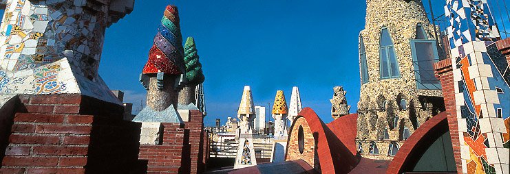
Ornamental Chimneys atop Paula Güell 
source: http://qrplaces.it/QRImages/Posto/50B97ACE-E177-2612-D099-BF345BB336C2/palau_guell_20110708_1305_5687.jpg
The masonry siding, reflecting medieval architecture, is topped off with these extremely ornamental chimneys, looting the roof with colors and forms that totally contrast with the rest of the building, but create harmony and visually holds the building together. Twenty of these sculptural chimneys, made of ceramic tile, stained glass, and marble line the roof and are symbols of count Güell and his wealth.

No other architect at this time was as bold as Gaudi was. He took ideas form nature, plants, animals, and human anatomy and united them with architecture. His boldness and uniqueness magnifies him as one of the most pivotal architects that influenced modern architecture. He broke down the barriers of design at the time, incorporated all of his natural and architectural inspirations, and took architecture to new levels and realms with his boldness.


Sources: